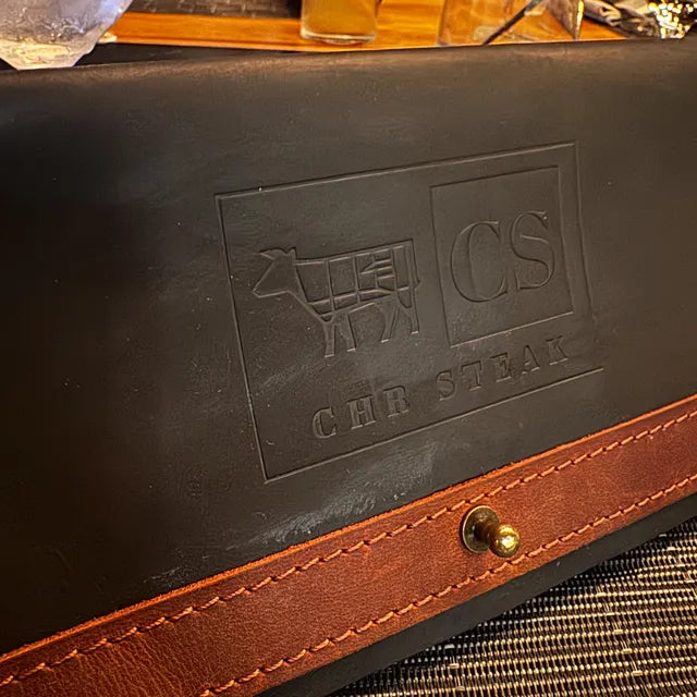
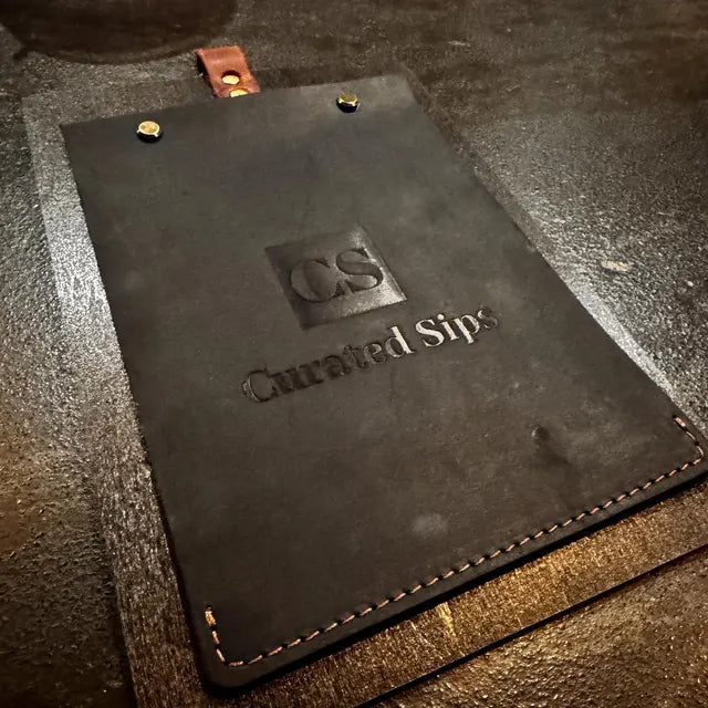
A tactile, premium solution for table presentation

Custom Leather Menu Covers for CS “Curated Sips”

When Details Define the Experience

In hospitality, small details shape the overall impression.

A menu is not just a list of items — it’s part of the atmosphere, part of how a guest perceives the place.

For this project, the goal was to create something that feels solid, restrained, and premium, without overcomplicating the design.

01

About the Venue

CS “Curated Sips” is a concept that blends drinks, mood, and a refined dining experience.

The interior already had a strong identity — dark tones, textured surfaces, warm lighting.

The menu needed to match that tone, not compete with it.

02

Our Task

The client wanted a solution that would:

  • look clean and premium
  • support the dark, атмосферний стиль закладу
  • be durable for daily use
  • feel good in hand, not just visually

Standard menu holders didn’t fit — they either looked too generic or too light for the concept. So we went with black leather menu covers combined with warm brown accents.
These menus are designed to work effortlessly in a real service environment.

They feel solid in hand, easy to handle for staff, and stable when placed on the table. The structure keeps everything neat and consistent, while the material holds up well under constant use. Nothing about them feels fragile or temporary.

The design stays minimal:

  • deep embossed logo instead of print
  • no extra graphics
  • focus on texture and material

The stitching and metal details add just enough contrast without breaking the overall calm look.

03

Materials & Feel

In this project, the way the menu feels is just as important as how it looks.

The first interaction happens through touch, and that moment sets the tone for everything that follows.

The leather has a soft yet structured surface — it doesn’t feel artificial or overly polished. Instead, it adds depth and a sense of character, something that naturally fits into a space built around atmosphere and detail. Over time, the material will age in a way that only enhances this feeling, becoming part of the story of the place.

The result is a menu that feels:

  • premium without being loud
  • tactile and pleasant to use
  • aligned with the venue’s identity
  • durable for everyday service

It’s not just a functional item — it’s part of the guest experience.

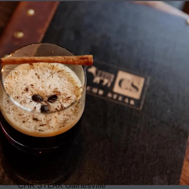
The menus feel solid, look very clean, and match the atmosphere of the place perfectly. The embossing detail is subtle but really adds to the overall impression. Thanks guys!

Project gallery